Contrast
Related WCAG Reference
If text, including images of text, lacks sufficient contrast with its background it won’t be legible to users with low vision or colour blindness. Controls and meaningful graphics also require good contrast.
Color contrast refers to the difference between the brightness of the background color and foreground color of digital content. For example, black text on a white background is very high contrast; light grey text on a white background is low contrast.
In Web Content Accessibility Guidelines (WCAG), contrast is a measure of the difference in perceived "luminance" or brightness between two colors and is expressed as a ratio. For example 1:1 is white on white and 21:1 is black on white.
The following examples are the ratios for the colour on a white background:
- Pure red (
#FF0000) has a ratio of 4:1. This sentence shows what pure red text looks like on a white background. - Pure green (
#00FF00) has a very low ratio of 1.4:1 and is difficult to read on a white background. This sentence shows how difficult it is to read this low contrast green text on a white background. - Pure blue (
#0000FF) has a contrast ratio of 8.6:1. This sentence shows what pure blue text looks like on a white background.
Meeting WCAG Level AAA criteria is often difficult, but that's not the case with enhanced contrast. We should strive for it whenever possible. To meet the WCAG Level AAA Success Criterion for enhanced contrast, increase the contrast ratio of small and large text as follows:
- Ensure small text (under 18 points [24 pixels] regular font or under 14 points [19 pixels] bold font) has a contrast ratio of at least 7:1 with the background.
- Ensure large text (at least18 points [24 pixels] regular font or 14 points [19 pixels] bold font) has a contrast ratio of at least 4.5:1 with the background.
For user interface components such as buttons or input boxes, there must be a 3:1 contrast ratio with adjacent colours. The 3:1 contrast ratio for adjacent colours also applies to meaningful graphics, which includes informative icons, lines in line graphs, and slices in pie charts.
To see more examples, visit:
- Web Aim Contrast and Color Accessibility
- ESDC Web Accessibility Course – Module 7 – Visual Design and colours – Contrast
How do I measure color contrast?
Avoid relying on your eyesight alone to determine whether a color combination can be used or not. Check contrast manually using a color contrast analyzer tool.
Colour
Related WCAG Reference
Write accurate text alternatives for all information that is conveyed by colour. The following example demonstrates how the information can be presented with a combination of colour and text.
Bad Example #1 – Not accessible
Problem: In the table below, colour alone communicates severity. There are no text labels. A legend / key below the table uses colour to define the severity values.
| # of defects | Severity | Status |
|---|---|---|
| 20 | Open | |
| 30 | Close | |
| 15 | In progress |
Red = High, Yellow = Medium, Green = Low
Good Example #1 – Accessible
This version of the table uses colours to convey information with text labels that ensure the meaning is perceivable by persons who are not able to see the differentiation of the colours.
| # of defects | Severity | Status |
|---|---|---|
| 20 | High | Open |
| 30 | Medium | Close |
| 15 | Low | In progress |
Tables used in good and bad examples are from ESDC Web Accessibility Course – Module 7 – Visual Design and colours – Colour.
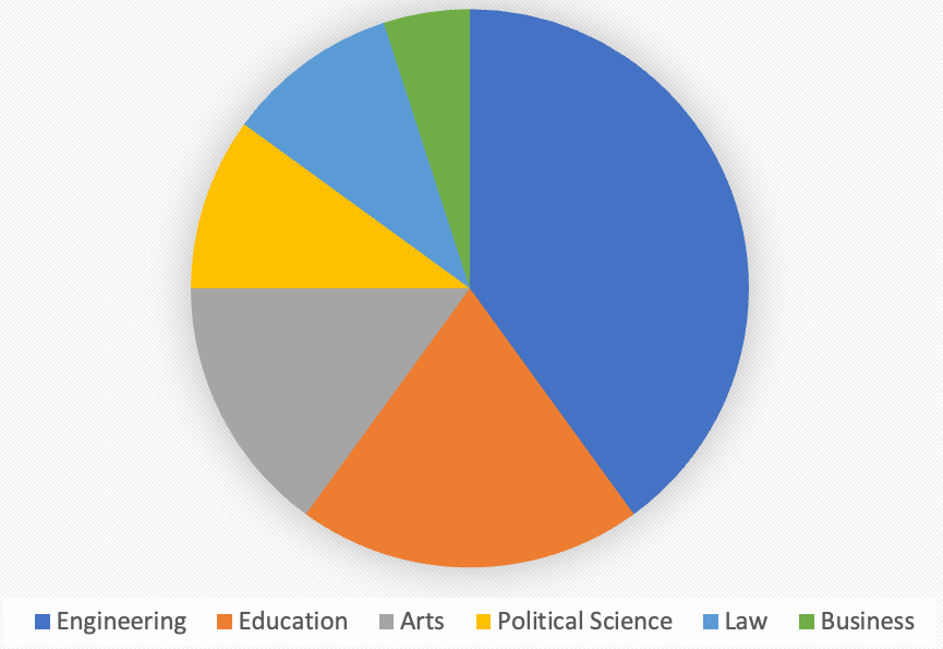
Bad Example #2 – Not Accessible
For individuals who have difficulty perceiving certain colors, the following pie chart can be as useful as having the information displayed in all values of gray. The colour coding information is not perceivable.
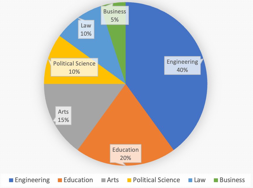
Good Example #2 – Accessible
Combining colour with labels can improve comprehension for all individuals, not just those with colour perceiving disabilities. The following pie chart includes labels that identify the data value and the category name on the chart in addition to displaying a legend. The result is a combination of both colour and text labels that provide the user with the information needed to interpret the chart.